How Wes Anderson’s Creative Team Designed The French Dispatch Magazine for His Latest Film
Erica Dorn and Javi Aznarez created a cinematic version of a fictional magazine that lies at the heart of Anderson’s love letter to print journalism
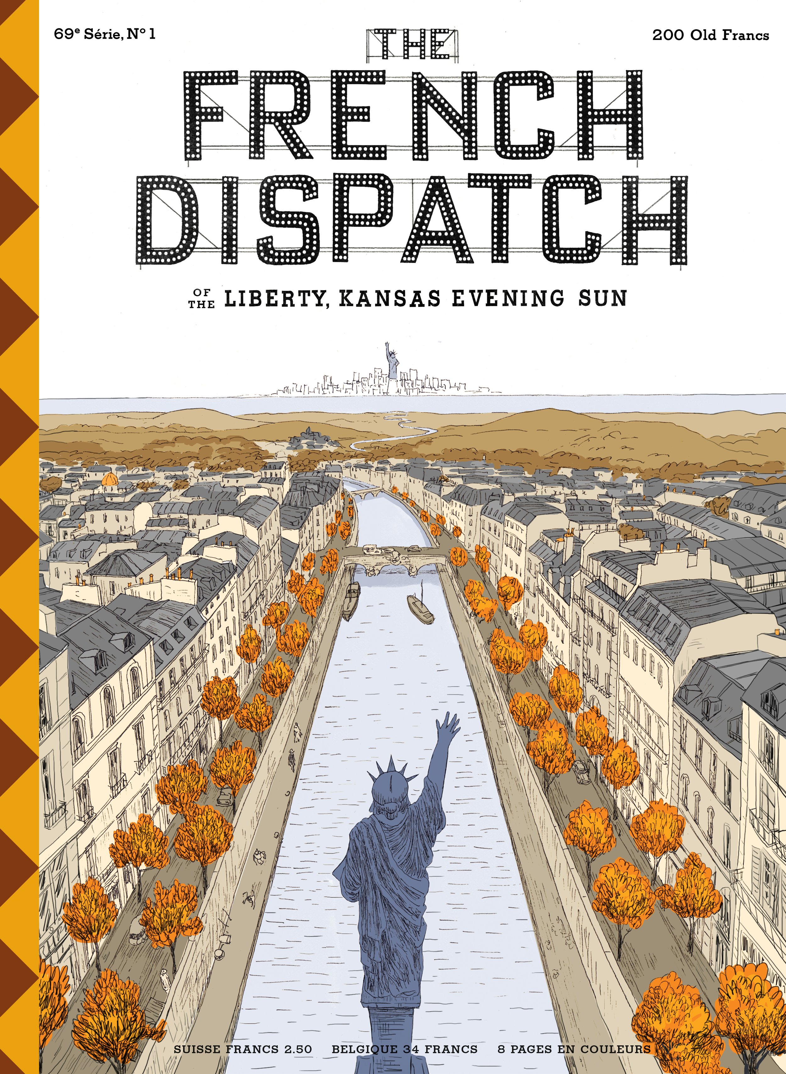
During a quick scene in The French Dispatch, Hermès Jones, a magazine illustrator played by Jason Schwartzman, gets an earful from Arthur Howitzer, Jr., the editor-in-chief played by Bill Murray. Pasted on the wall next to Jones’ desk are 12 past covers of The French Dispatch, showing an assortment of imagined stories; in one, the Statue of Liberty in Paris waves to the one in New York, and in another, a group of men in suits break into a dance. It’s one of those blink-and-you-miss-it-moments, which even in its brevity, hints at the scrupulous eye of auteur Wes Anderson, whose latest film follows the staff of a fictional American publication in France, set in the imagined town of Ennui-sur-Blasé.
The film, which traces the making of the magazine, draws on Anderson’s lifelong love for The New Yorker, which he discovered in eleventh grade. “The French magazine in the film obviously is not The New Yorker—but I was, I think, totally inspired by it,” said Anderson in a recent interview with the actual New Yorker. While even the characters of the film were based on New Yorker journalists and moments from the periodical’s storied history, the magazine in the film itself had to have a very distinct identity.
For a fictional magazine that actually doesn’t even exist, The French Dispatch feels impossibly real. To create the publication, Anderson and co-producer Octavia Peissel brought designer Erica Dorn on board, who had previously worked with Anderson on Isle of Dogs, creating the graphics and props for the sets in close collaboration with Annie Atkins. “It was actually my first time working on a movie, but I think I did okay because I was asked to join The French Dispatch as the lead graphic designer a few months after the Isle of Dogs released,” says Dorn.

Photographs courtesy of Searchlight Pictures
One of the first graphics Dorn created for the film was The French Dispatch masthead. “We were working on the logo and The French Dispatch bureau set simultaneously, and Wes suggested we try the signage on the facade as the masthead, including the flashbulbs inside the letters and the scaffolding that holds it in place,” she says. To create the publication itself, she delved deep into her research, ordering a couple of vintage New Yorkers from 1975 and earlier, and a few old issues of The Paris Review. “One of the biggest challenges was the fact that the publication needed to feel like a historic magazine that had been around a long time, which also belonged in the world alongside other iconic magazines (like the New Yorker), but at the same time needed to have its own identity,” says Dorn. While The French Dispatch looks like it belongs in the past, its exact era is inscruitible, much like Anderson’s cinematic style, which never ties a story too closely to a timeline. It is in this fluid, yet considered design of the magazine that Dorn’s light-handed touches reveal themselves. Case in point: a geometric pattern on the spine that creates “an iconic and recognizable look.”
“Because no one ever opens the magazine in any of the shots, the only physical pieces that exist of the fictional magazine are the covers, and the chapter titles designed to look like pages from the magazine (except that they are designed for the exact crop you see in the movie),” says Dorn. “Even though the full magazine doesn’t exist as a prop, it exists in our imagination as ‘a factual, weekly report on the subjects of world politics, the arts (high and low), fashion, fancy cuisine and fine drink, and diverse stories of human-interest set in faraway quartiers.’
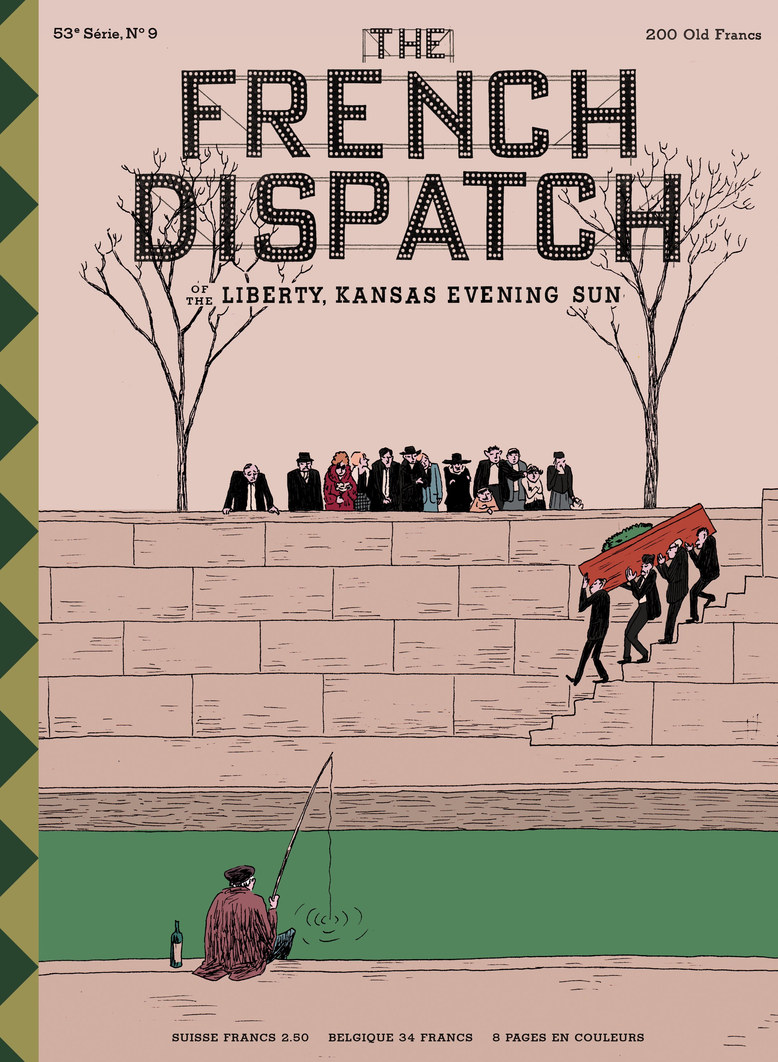
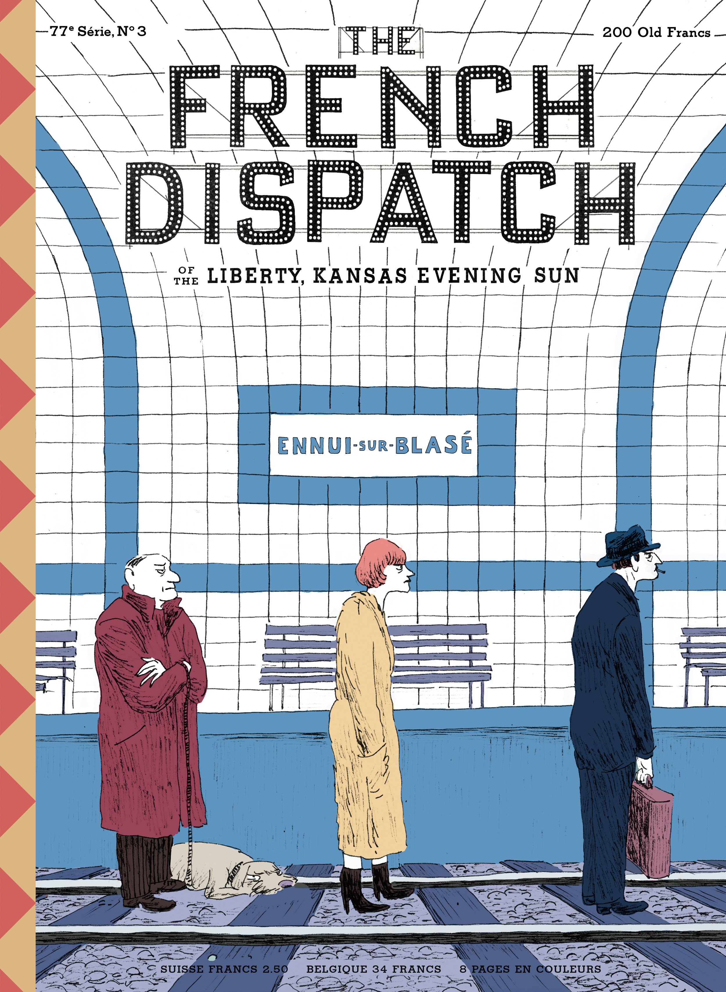
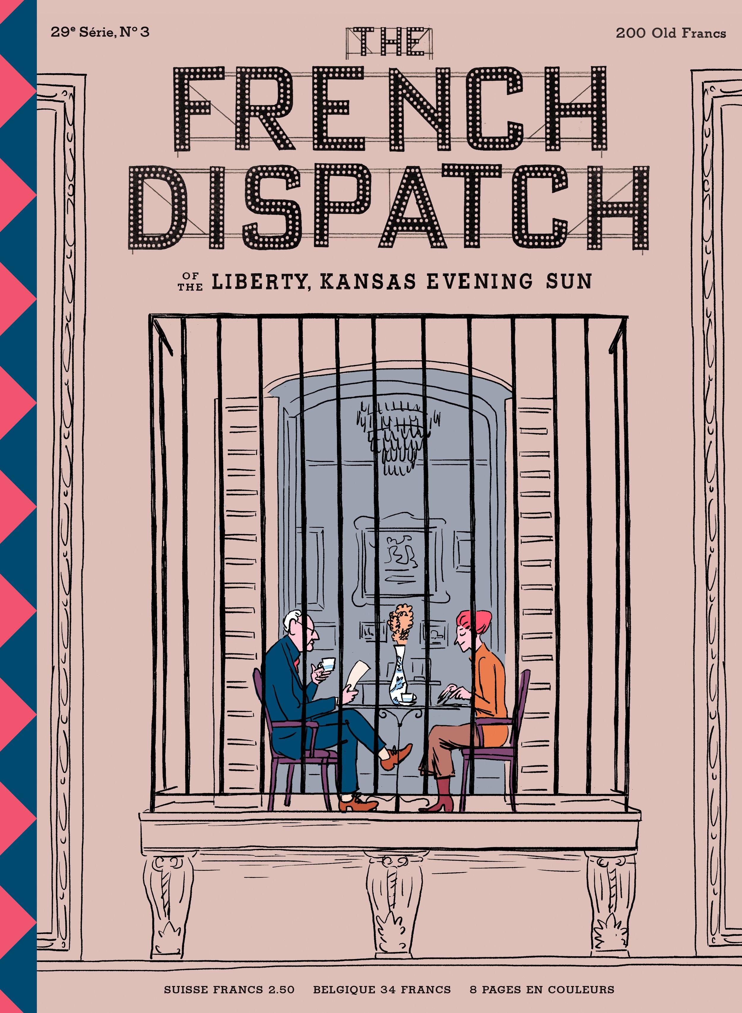
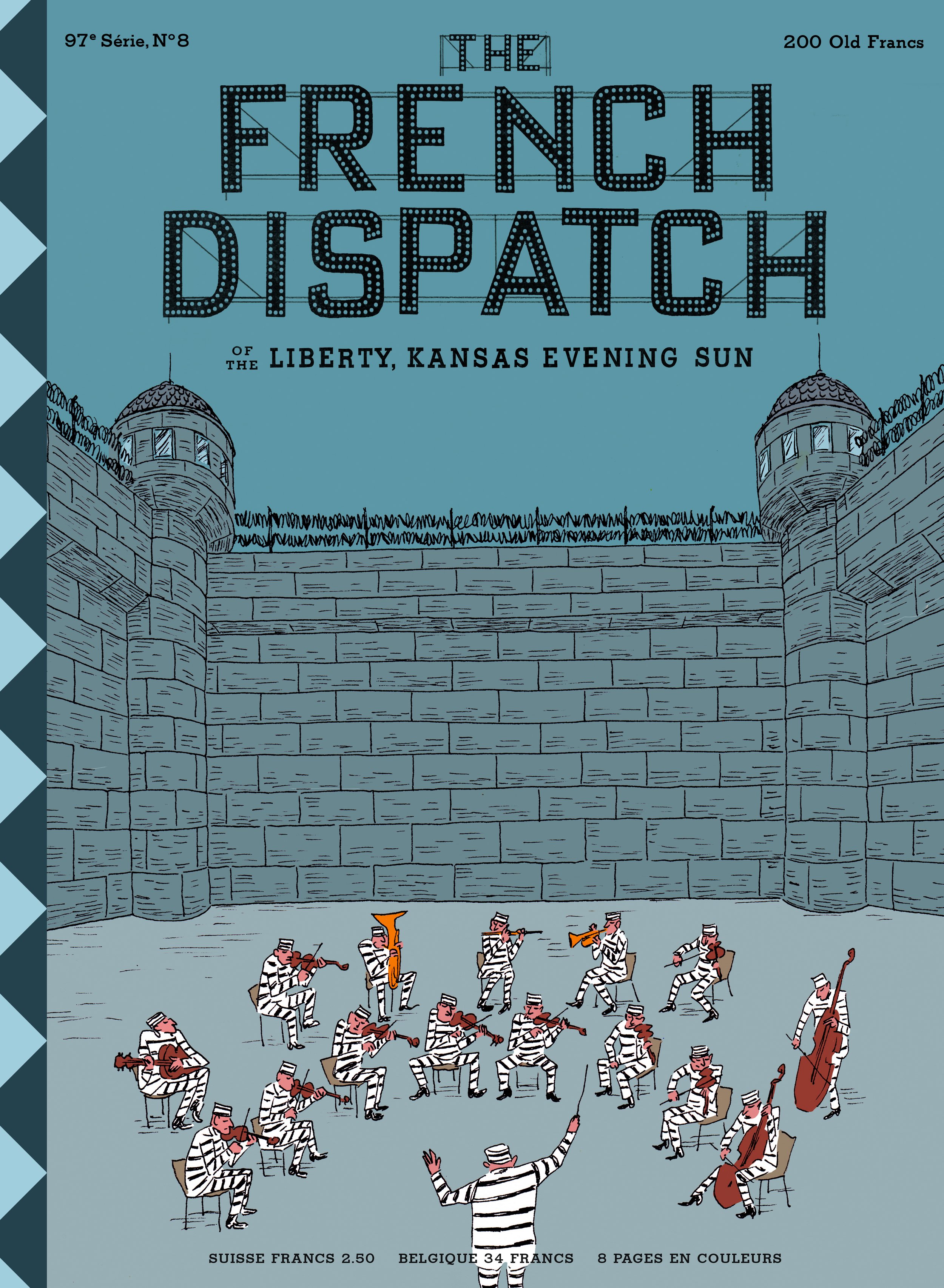
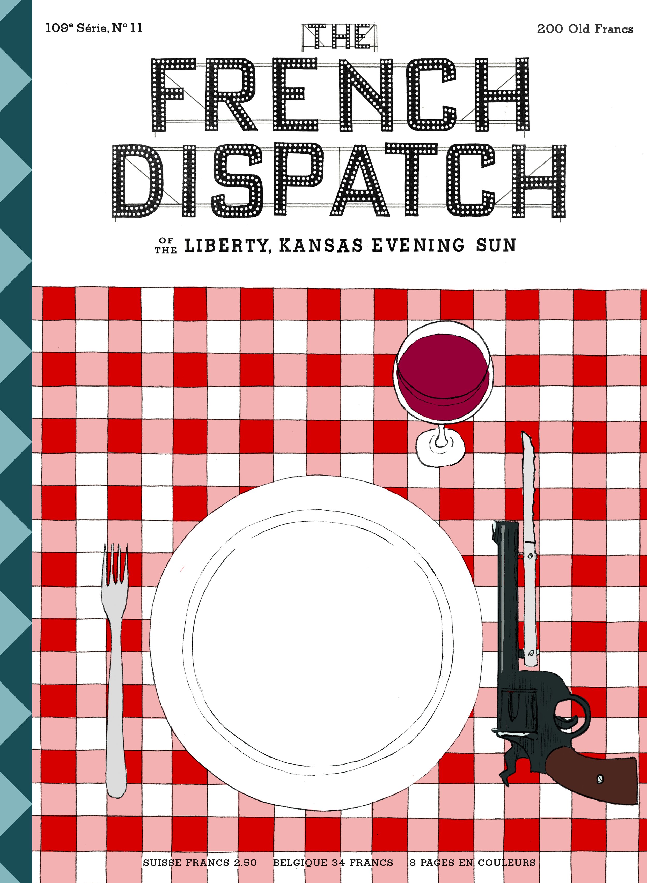
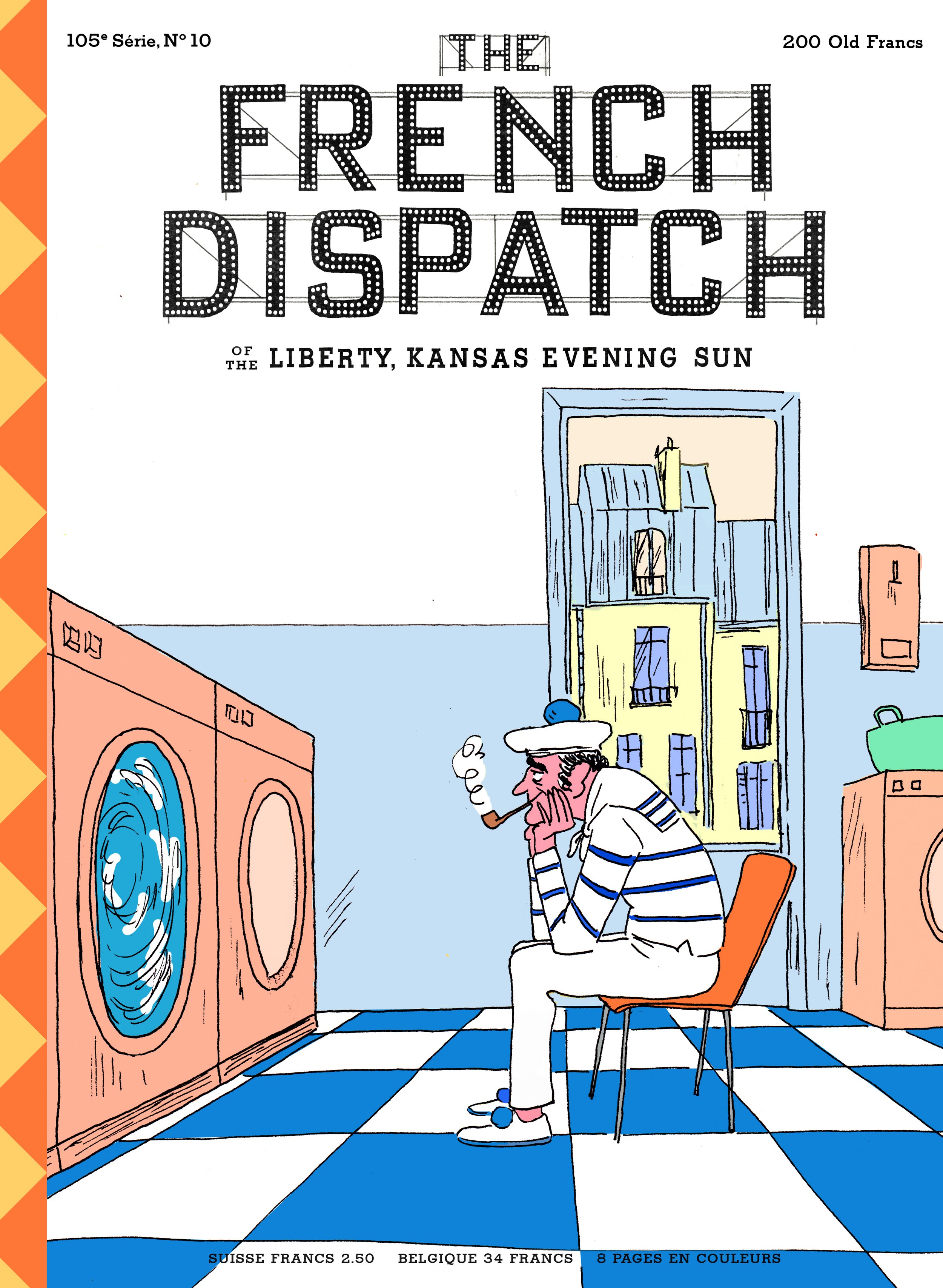
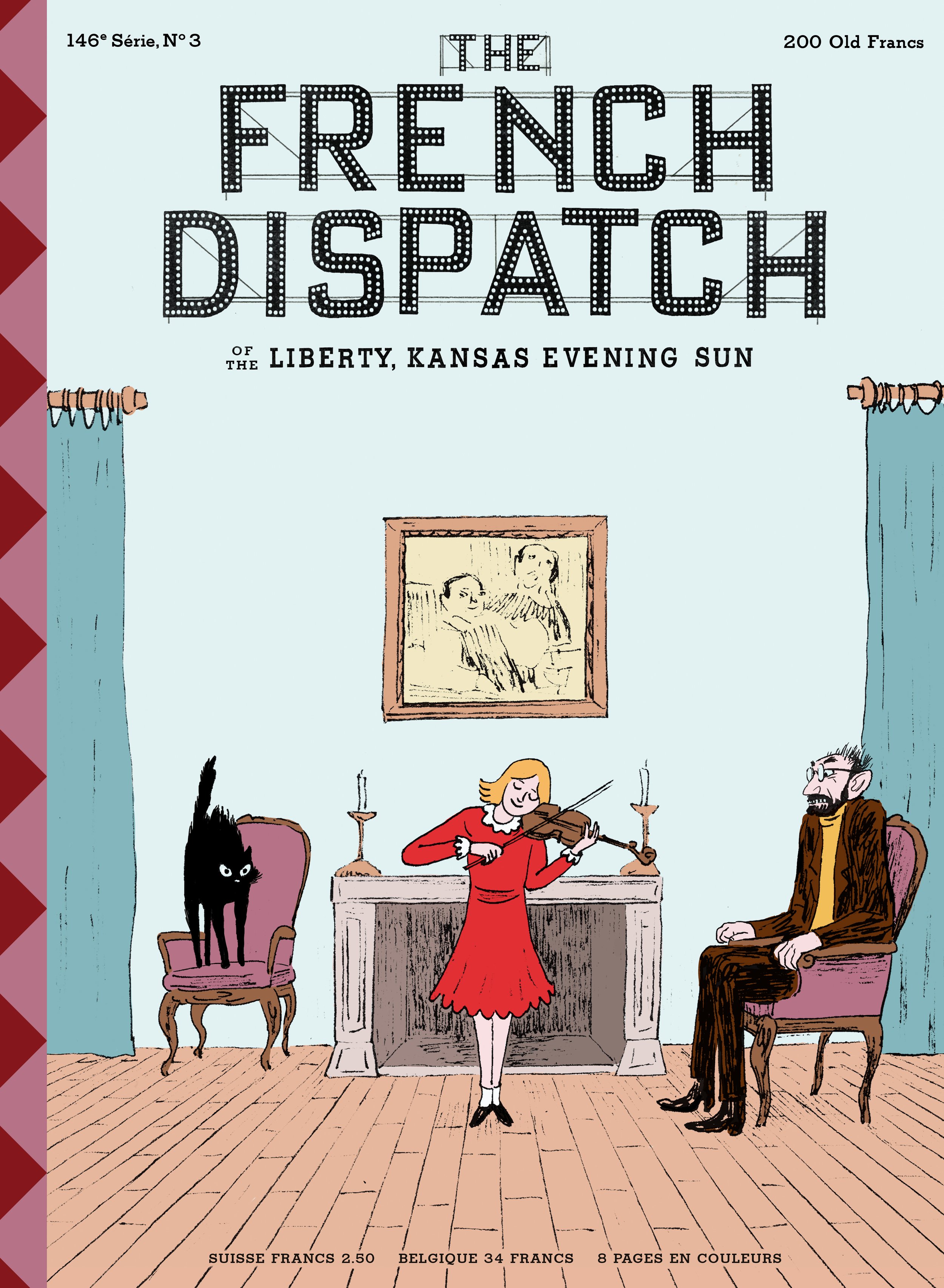
For a visionary like Anderson, just creating the magazine as a cover-only prop seen in a fleeting scene wasn’t enough. Peissel and Anderson commissioned illustrator Javi Aznarez to create the official film poster, which featured portraits of the characters and a handful of situational illustrations on the sets. They quickly decided to expand Aznarez’s initial brief to include four posters for each of the four chapters in the anthological film, and a series of fictional covers for the magazine. Aznarez, known for his strong, almost cinematic visual style seen in his commissions for The New Yorker and The Washington Post, was only at The French Dispatch editorial office in Angoulême, France (where the film was shot) for 10 days; the rest of the work continued in his hometown in Cadaqués, where he created almost 30 covers for the magazine, working remotely, but in close tandem with Anderson.
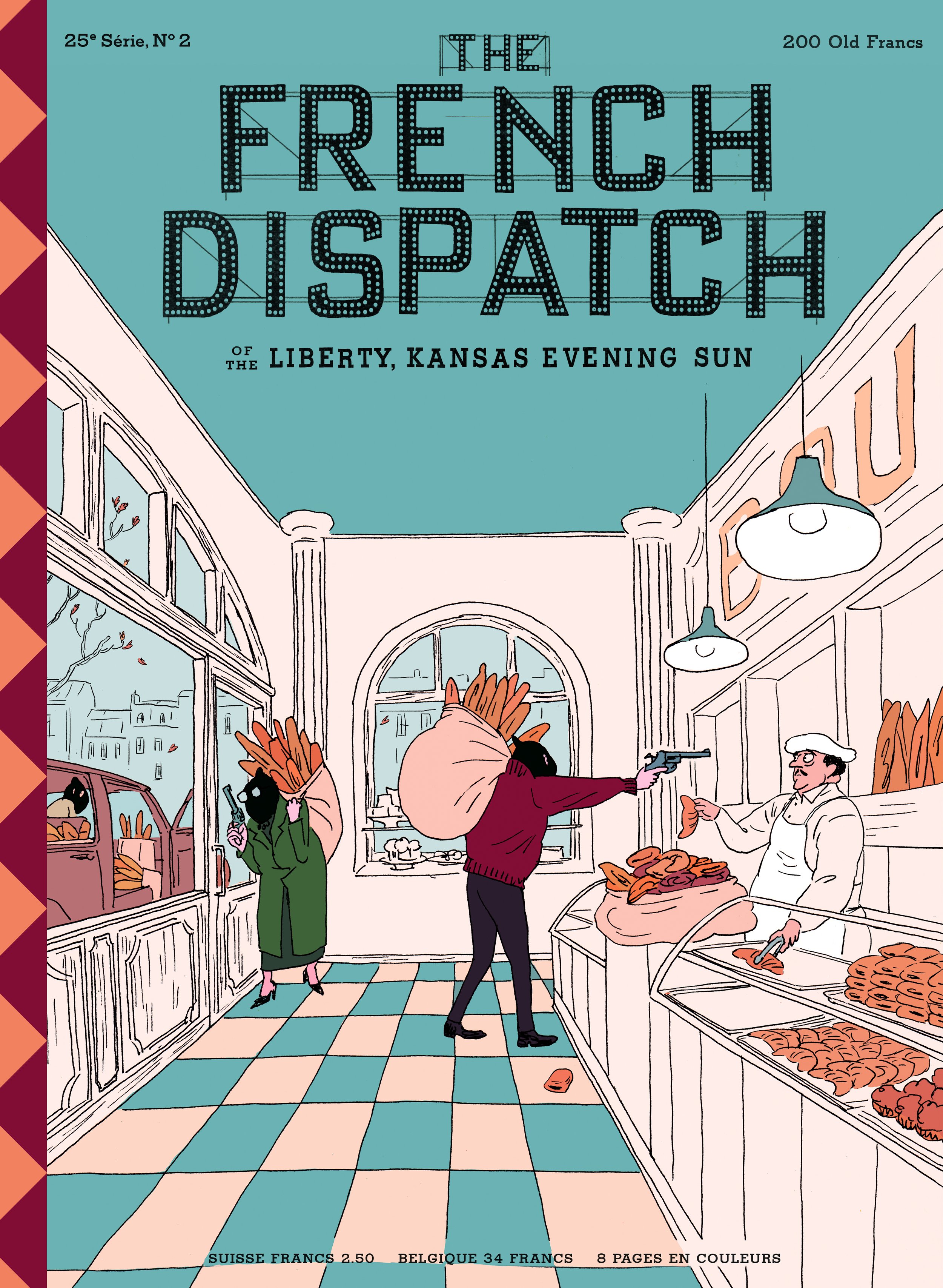
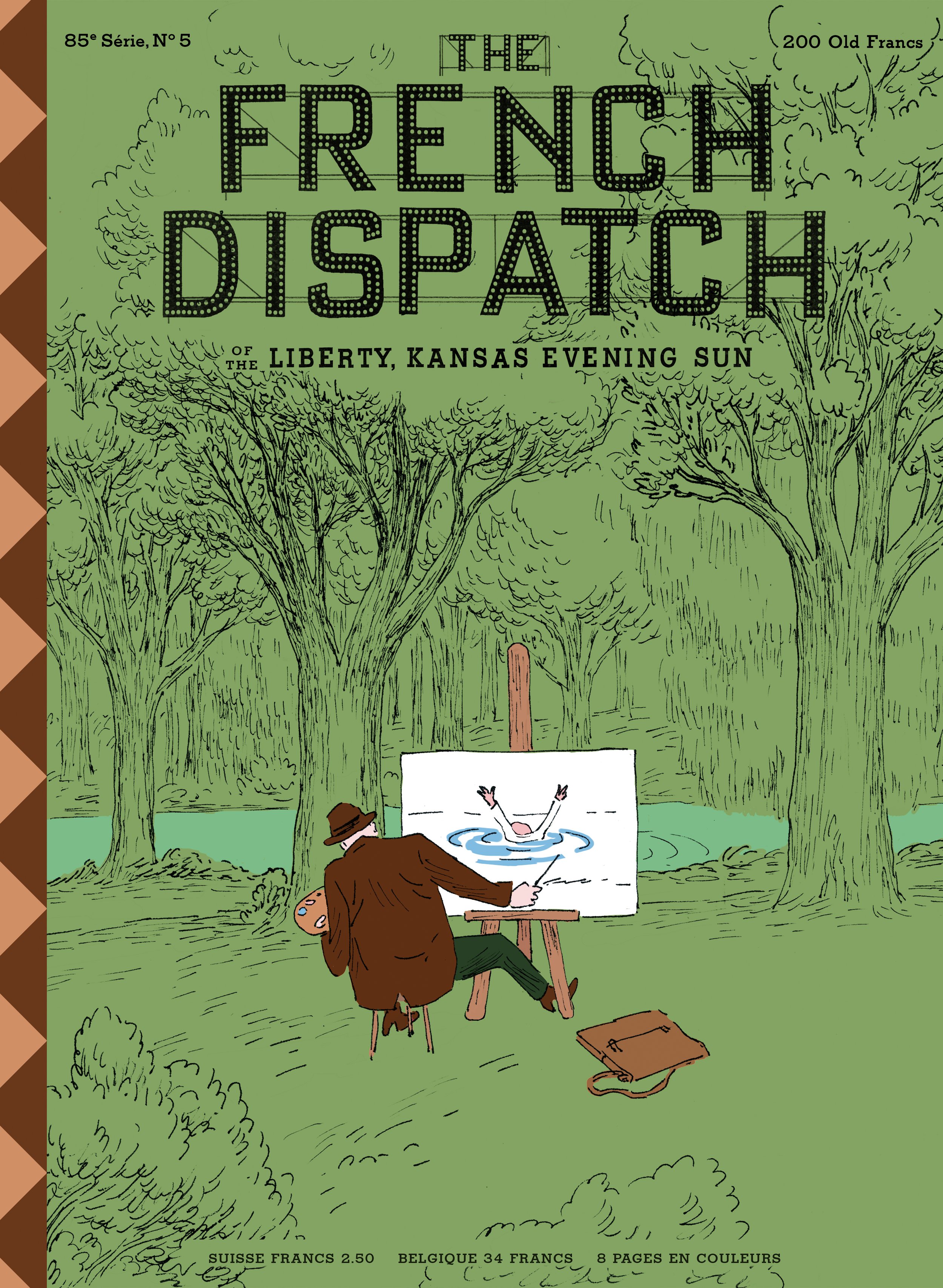
The tongue-in-cheek, often bizarre covers draw on Aznarez’s imagination and fictitious landscapes. On one cover, a chef chases a headless chicken; on another, an artist sits on the river bank, painting a drowning man. The surreality is often reminiscent of New Yorker’s iconic cartoons; with each cover Aznarez visualises a strange, yet funny bite-sized story: a bakery gets robbed at gunpoint, with the gunmen stealing bags of freshly baked baguettes; in another cover, a dead pianist slumps over a piano, with a bullet hole in the window.

“I was given a lot of freedom with these covers, and I had several months to play and imagine myself in post-war France,” says Aznarez. “I always try to draw the absurdity of the things I see or hear around me.” The cover of the headless chicken was inspired by the true story of a chicken that lived several months without a head, and then Aznarez added the cook as a nod to one of the chapters of the film. “The cover of the dead pianist is a fantasy from my childhood,” he reveals. “At my parents’ house we had a neighbor who gave piano lessons. At first, it may seem very bucolic to hear a piano in the background, but when it plays every day you feel like murdering the neighbor. I tend to have very dark thoughts, and it feels good to draw them out and soften them with a bit of humor; it’s great therapy.”
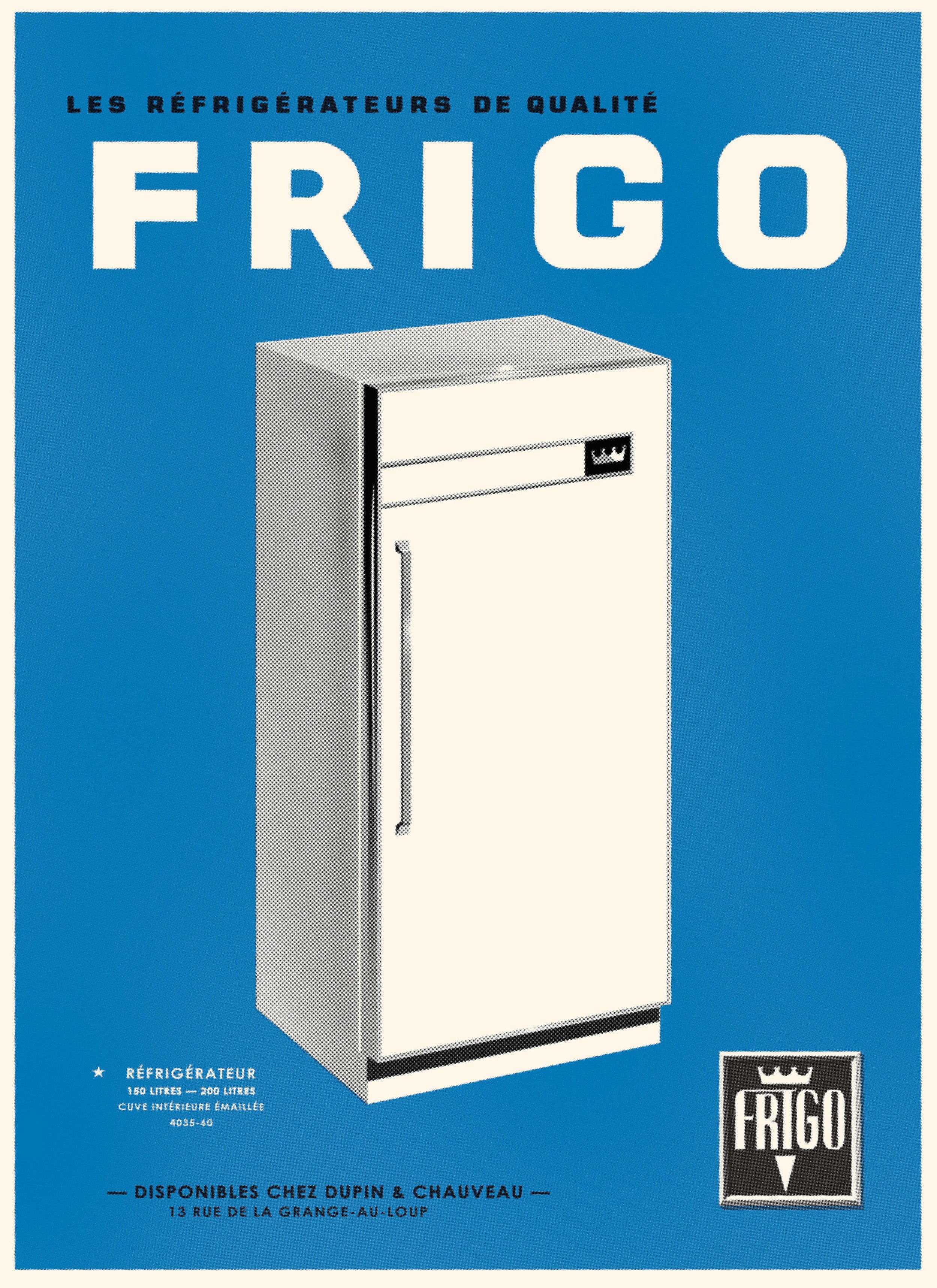
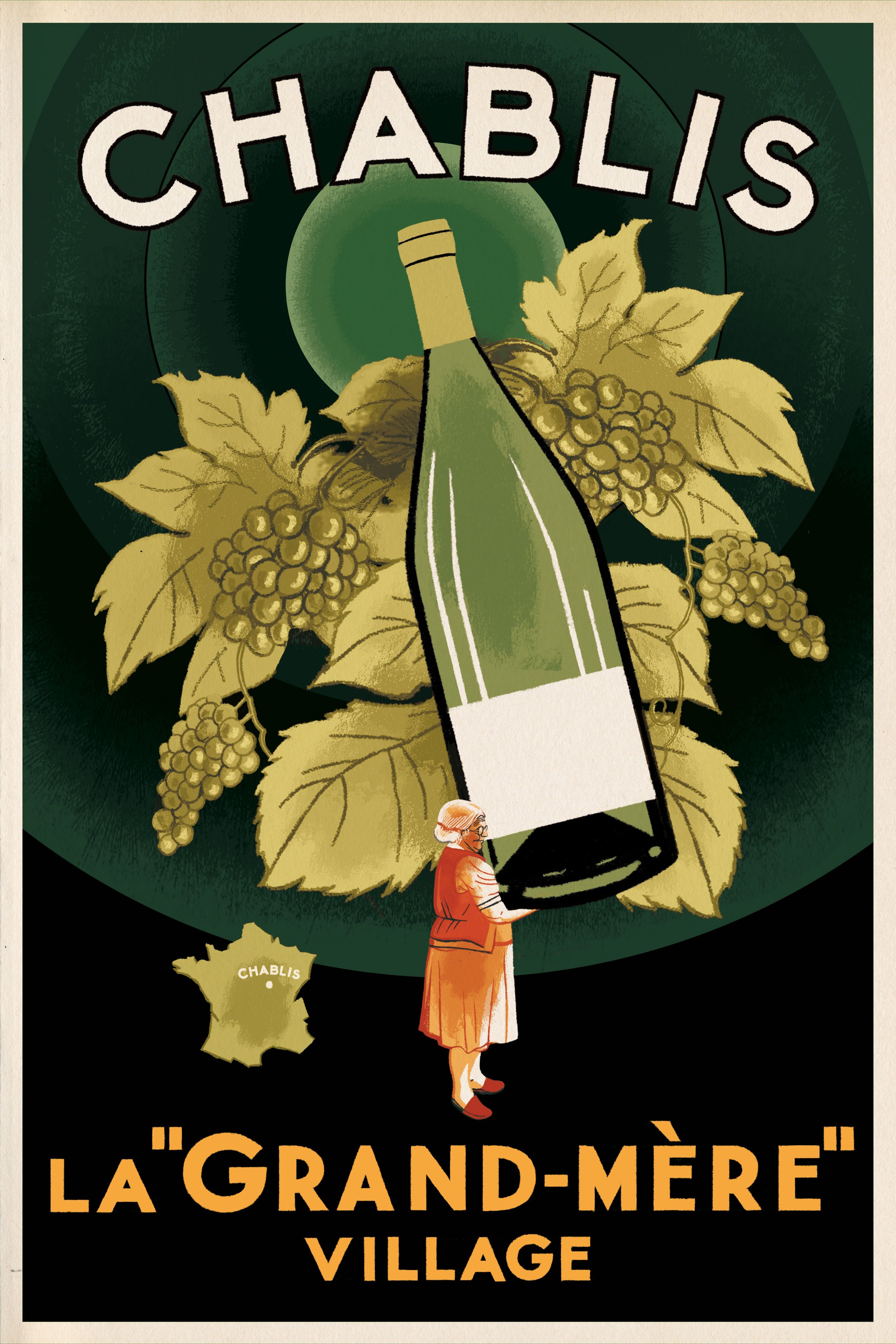
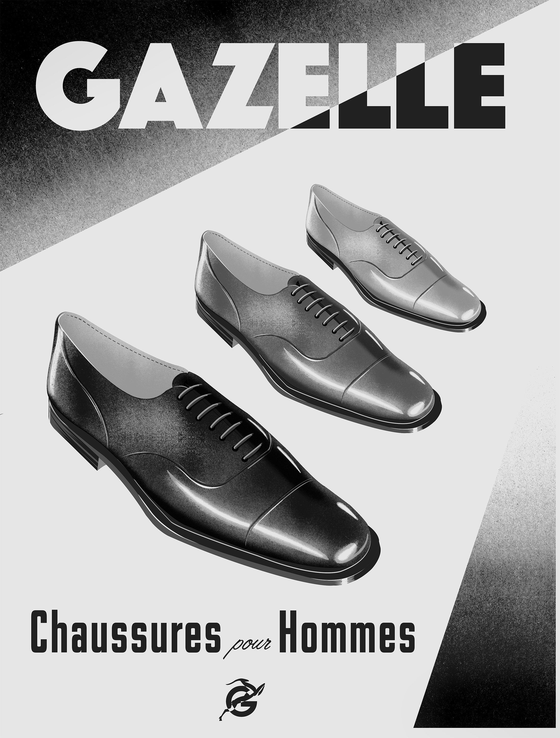
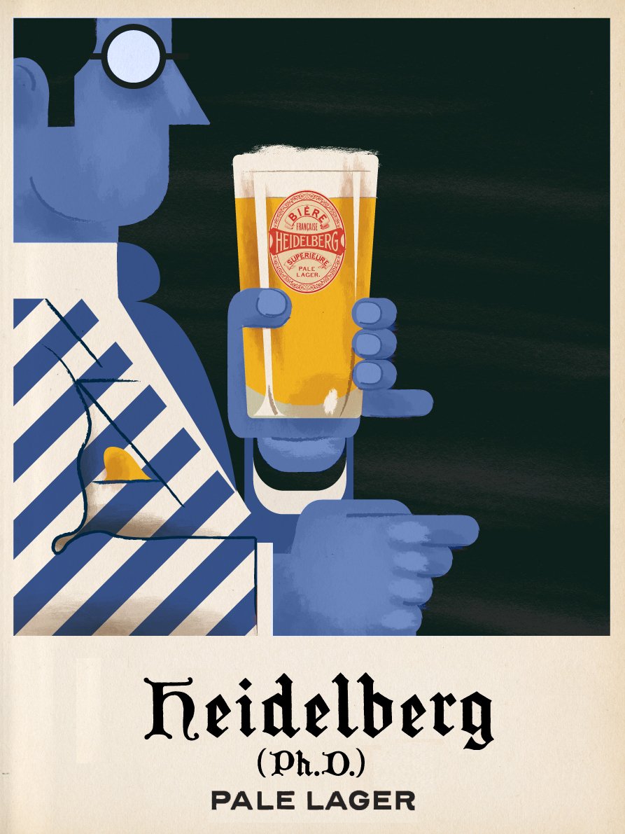
While Aznarez worked on the covers, Dorn was busy creating posters for the sets of Ennui-sur-Blasé, which were later reused as back covers of the magazine. Originally conceived as posters for the streets and metro stations of the town, the artworks showcase fictional products, like a bottle of ‘Off-Black’ cognac, a refrigerator and a typewriter. “These posters came about mostly as part of the world-building of Ennui-sur-Blasé,” says Dorn. “They needed to feel old, very French, and very typical of the sort of thing you would have found in a small town like Ennui in the mid-70s.” Dorn’s team brought on many collaborators, like Pascal Blanchet, who illustrated the poster for the typewriter and the shoes, while Atelier du Grain, a local collective from Angoulême created the posters for the pale lager and the Chablis.

For Anderson, who worked very closely with both Dorn and Aznarez, no detail was too small to overlook. “He has an incredible eye, and he knows exactly what he wants,” says Aznarez. “He immediately sees if the image works or if it is necessary to add some ingredient to make it tastier.” On his sets, compromises were rare and challenges abound. For one scene, the script outlined a portrait of Bill Murray that had to be painted with jam and coffee on a paper napkin. “After many attempts and wasting a lot of napkins we discarded the jam,” remembers Aznarez. “I had to repeat it more than a 100 times until I finally got it right. Drawing on paper napkins with ink and coffee is a nightmare.”
In a delicate balance between exacting challenges and the joy of working with one of filmmaking’s most legendary visually-minded directors, Dorn and Aznarez brought to life a fictional magazine with details that are almost impossible to fully appreciate in the film’s 103 minute runtime. Which is why, Dorn insists, you must stay till the very end. “Keep your eyes peeled for a parade of covers that pops up in the main-on-ends,” she says. It’s a little treat tucked away for the ones who hang till the last credit rolls.
This article was originally published on Eye on Design.