The Oscar-winning Filmmaker + Graphic Designer Satyajit Ray Made the Best Posters You've Never Seen
The director’s revolutionary films often overshadow his work as an illustrator and graphic designer, an oeuvre as rich and diverse as his filmography
![Mahanagar [The Big City] 1963.jpg](https://images.squarespace-cdn.com/content/v1/5befb3b84611a081dd003798/1618119925983-CHGICKOQBVY52PHHV6N8/Mahanagar+%5BThe+Big+City%5D+1963.jpg)
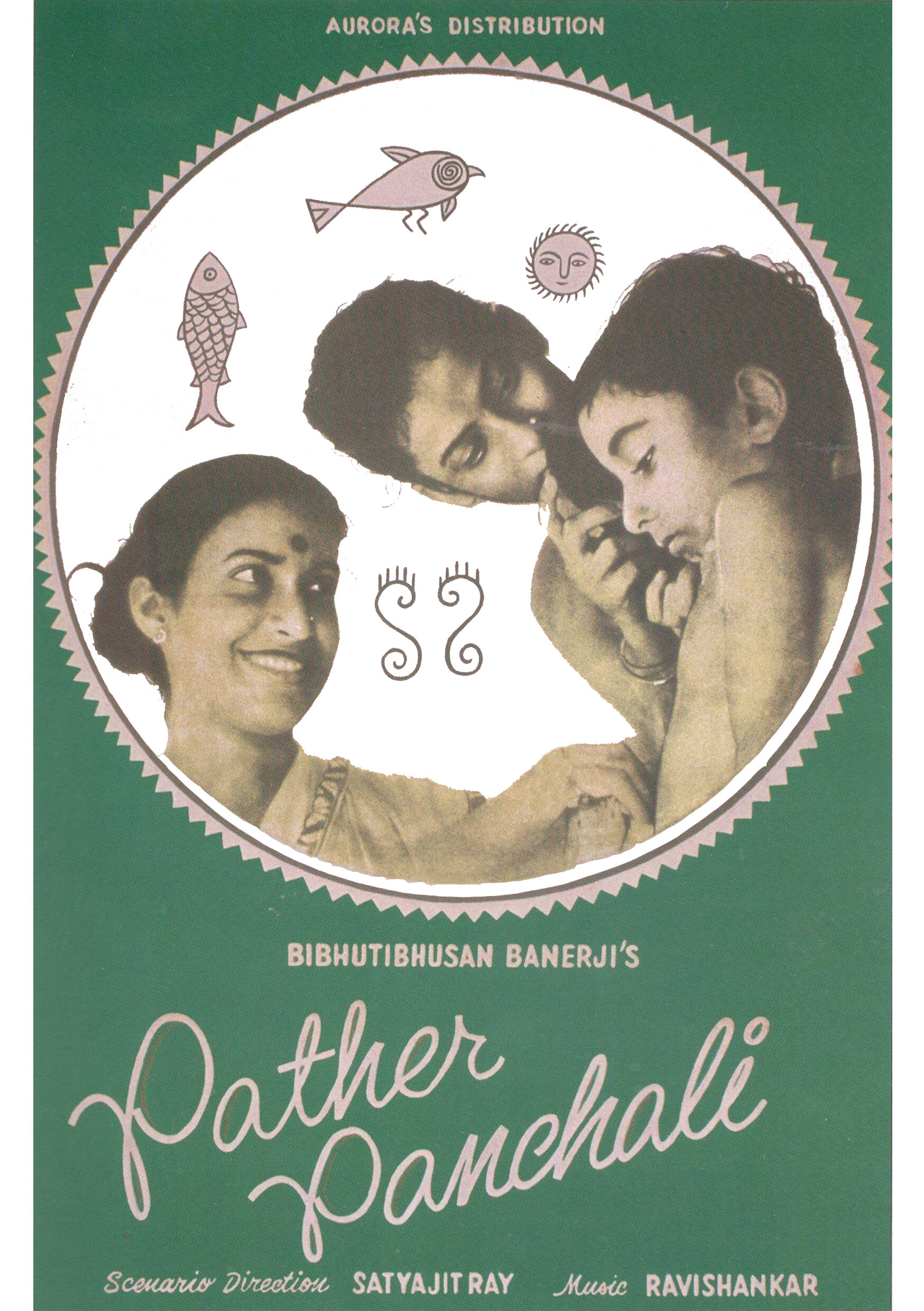
In 1955, the winding gulleys of Kolkata in India were awash with large posters and almost translucent paper flyers that captured an intimate, yet everyday moment between a mother, her daughter, and her son. This now-iconic poster introduced the city to Pather Panchali [A Song of the Little Road], the debut feature and magnum opus of filmmaker Satyajit Ray that changed the trajectory of Indian cinema forever.
One of the foremost filmmakers of the 20th century and a maestro of Indian cinema, Ray found the inspiration for his first film while creating the cover and illustrations for a children’s version of Pather Panchali, a renowned Bengali novel by writer Bibhutibhushan Bandopadhyay. His tryst with filmmaking began when he was struck by the cinematic potential of the story, which traced the life of six-year-old protagonist Apu and his family as they battled the challenges of impoverished rural life in West Bengal.
![Poster for Ganashatru [The Enemy of the People] 1989, Satyajit Ray](https://images.squarespace-cdn.com/content/v1/5befb3b84611a081dd003798/1618120161093-5O8U9D5M2AULI0LQN3MW/Poster+for+Ganashatru+%5BThe+Enemy+of+the+People%5D+1989%2C+Satyajit+Ray)
Poster for Ganashatru [The Enemy of the People] 1989, Satyajit Ray
However, his repute as a revolutionary filmmaker often shrouds his lesser-known past as an illustrator and graphic designer, though his oeuvre as a graphic artist reveals itself to be as rich, layered, and diverse as his filmography.
Ray was born into a family of writers, poets, and illustrators in 1921—a time when Kolkata was gradually emerging as a cosmopolitan city nurturing intellectuals and modernists. Ray completed a degree in economics before moving to Shantiniketan to study painting at the Kala Bhavana at Visva Bharati University, whose teachers radically rejected the academic style of painting. The focus on both originality and Indian traditional art marked the emergence of a more modern style for Indian art students and visual culture alike.
“His then-unique style shrugged off the colonial hangover, and Indianized publication design and advertisements in a way Indian audiences had never seen before.”
Ray studied under the tutelage of stalwarts like Nandalal Bose and Benod Behari Mukherjee, whose profound influence would reflect on his body of work through his lifetime. They taught him to break rules while also looking to his own heritage for inspiration. At 22, he joined the British advertising agency D.J. Keymer (present-day Ogilvy & Mather) as a junior visualizer. While other ad firms at the time were looking to the West for inspiration, Ray introduced Indian folk art motifs and calligraphic details to advertising for the first time. He juggled witty campaigns for biscuits, hair oils, and cigarettes, while also designing book covers and jackets. His then-unique style shrugged off the colonial hangover, and Indianized publication design and advertisements in a way Indian audiences had never seen before.

In 1950, D.J. Keymer sent Ray to London to work at the agency’s headquarters, an opportunity that introduced him to world cinema. In just three months, he watched 99 movies and penned the script for Pather Panchali while at sea, on his way back to India. However, his preparation for filmmaking was in the form of his more familiar medium of illustration. “My earliest memories of my father are of him working in his study at home, storyboarding his films. He would always sketch every scene by hand to visualize it in his mind first; storyboarding for him was a revered ritual,” says Ray’s son, filmmaker Sandip. “From his very first film, he took charge of the creative direction for the graphic collateral, like posters and flyers. I remember him holed up in his study, illustrating, coloring, and splicing images together until the artworks were ready for printing.”
![Nayak [The Hero] 1966, Satyajit Ray](https://images.squarespace-cdn.com/content/v1/5befb3b84611a081dd003798/1618120452536-W0WDEE5KHVZKJ49A8T78/Nayak+%5BThe+Hero%5D+1966.jpg)
Nayak [The Hero] 1966, Satyajit Ray
A rebel at heart, Ray hadn’t forgotten his lessons on smashing prevalent rules from his days at Shantiniketan. At a time when posters for mainstream commercial Indian cinema cashed in on its celebrities and the then-new visual attractions of the film, Ray’s posters distilled the essence and profundity of his stories. Moving past the more traditional, extravagant hand-painted Indian cinema posters, Ray introduced photography and experimented with different visual techniques. “He had a deep interest in photography, especially photojournalism. He extensively studied the work of Henri Cartier-Bresson. It was inevitable for photography to seep into his poster designs,” says Sandip.
“At a time when posters for mainstream commercial Indian cinema cashed in on its celebrities and the then-new visual attractions of the film, Ray’s posters distilled the essence and profundity of his stories”
The poster for Pather Panchali uses a snapshot from the film, where the protagonist Apu is seen with his mother, and sister Durga. Caught in a mundane, quotidien moment as Durga combs Apu’s hair, the image crystallizes the lyrical and homespun feel of the film. Ray frames the image in a folk art-inspired circular design, resembling an alpana (hand drawn patterns made with ground rice and water, painted on the floors of the house during auspicious ceremonies and festivals). He added simplistic motifs of a sun, fish, and a bird—which almost look like doodles by the young protagonist Apu. Although this poster was plastered across the city walls in Kolkata, Ray wasn’t quite content. He designed a neon sign of Apu and Durga running, which was strategically placed in a busy location in the city.
The posters’ conception would begin during the final stages of the film’s editing process; when Ray would retire to his home studio—a room flanked by large windows that pooled light onto his drawing board. Surrounded by ink stands, pens, and paintbrushes, he would make just enough space for himself amidst towers of books ranging from Bengali literature, to 15th-century Italian art and modern British theater design. In his posters, he used a wide variety of styles and mediums including woodcuts, linocuts, scraperboards, and pen and ink sketches. Whether intricately detailed or deceptively simple, his mixed media posters featuring cut-out floating heads, expressive typography, and the use of photography defined a futuristic and unprecedented style that was undeniably Ray.
“This was pre-digital times, so every artwork had to be done by hand, judged by the eye, and measured to scale. When he would make 30×40-inch posters, he would find a board of the exact size and gum the sides of a sheet of paper so it stuck to the board and remained stable through the sketching process,” says Sandip—about his perfectionism. “He would then use an amalgamation of photography and sketches, pasting images together and creating collages, while painting the other details.”
![Joi Baba Felunath [The Elephant God] 1979, Satyajit Ray](https://images.squarespace-cdn.com/content/v1/5befb3b84611a081dd003798/1618120631651-G7FT9NH2SGEQ7WDYL982/Joi+Baba+Felunath+%5BThe+Elephant+God%5D+1979.jpg)
Joi Baba Felunath [The Elephant God] 1979, Satyajit Ray
A master calligrapher, Ray had a profound love for typography; and two of his typefaces, Ray Roman and Ray Bizarre, won a 1971 international typography competition. His nuanced understanding of expressive typography is reflected in the poster for Mahanagar [The Big City] that follows the story of Arati, a housewife who disconcerts her traditionalist family by getting a job as a door-to-door saleswoman. The title that hangs over a portrait of Arati putting on a swipe of red lipstick is imagined in a boxy typeface, symbolic of the towering buildings and reminiscent of a cityscape.

According to Sandip, Ray would make two 30×40 posters for each film—one litho, and the other silkscreened. These were meant to be used in the city of Kolkata, while smaller 20×30 prints were sent to villages and the rural areas on its outskirts. Unfortunately, most of these silkscreen posters have been weathered or lost over time, though many of the litho versions remain. When his films started gaining global acclaim, many of Ray’s posters were reinterpreted by international artists like Peter Strausfeld for screenings and premieres across the U.S., UK, Japan, Germany, Poland, and former Czechoslovakia.
“Satyajit Ray simultaneously revolutionized Indian cinema and introduced India to graphic design, long before the country even knew what design truly meant.”
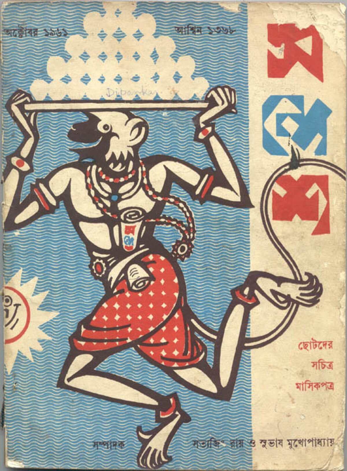
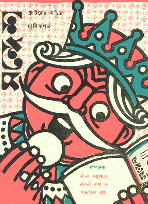
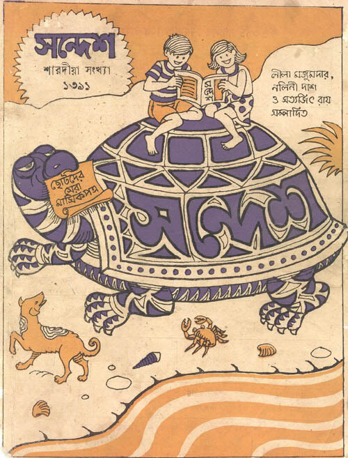
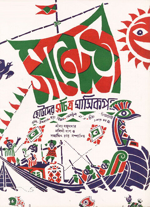
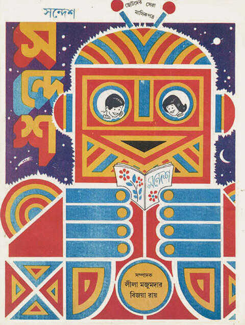
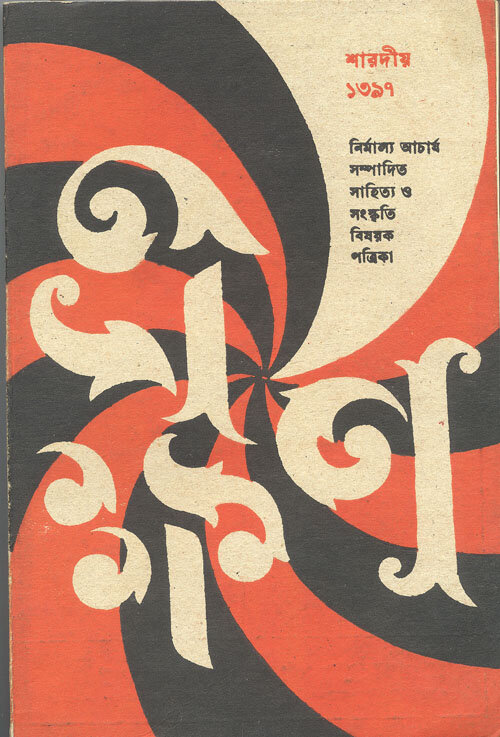
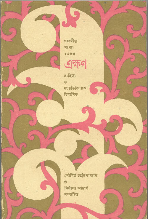
But the man who has been argued to be India’s first graphic designer could rarely sit still. His other numerous projects included reviving monthly children’s magazine Sandesh [meaning a Bengali sweet] that was founded by his grandfather, author and entrepreneur Upendrakishore Ray in 1913. He designed the covers and layouts, illustrated entire issues of the magazine, wrote stories, created puzzles and brainteasers, judged contests, and even answered fan mail. “There were no cover stories in the magazine, so the illustrated artwork had to capture the spirit of the issue,” says Sandip. Ray also created the debut cover for a 1961 literary magazine called Ekkhon [Now], and went on to conceptualize several others.
Ray accepted an Honorary Oscar for Lifetime Achievement in 1992 just 24 days before his death. He simultaneously revolutionized Indian cinema and introduced India to graphic design, long before the country even knew what design truly meant.
“He was a very social and accessible man,” says Sandip. “When he started working on his posters or artworks was perhaps the only time he liked to be left alone. He didn’t have a secretary, so he would answer all his calls himself, and as his career took off, there were quite a few calls every day. He was a man who wanted to do everything himself—a trait that shone through his day to day life, and reflected in his work as well.”
This article was originally published on AIGA Eye on Design.